
milligram밀리그램 · Skincare
- Brand identity development
- Self-initiated concept · 2026
- Scope
- Positioning · Wordmark · Colour · Typography · Graphic system · Imagery direction · Guide
- Concept applications
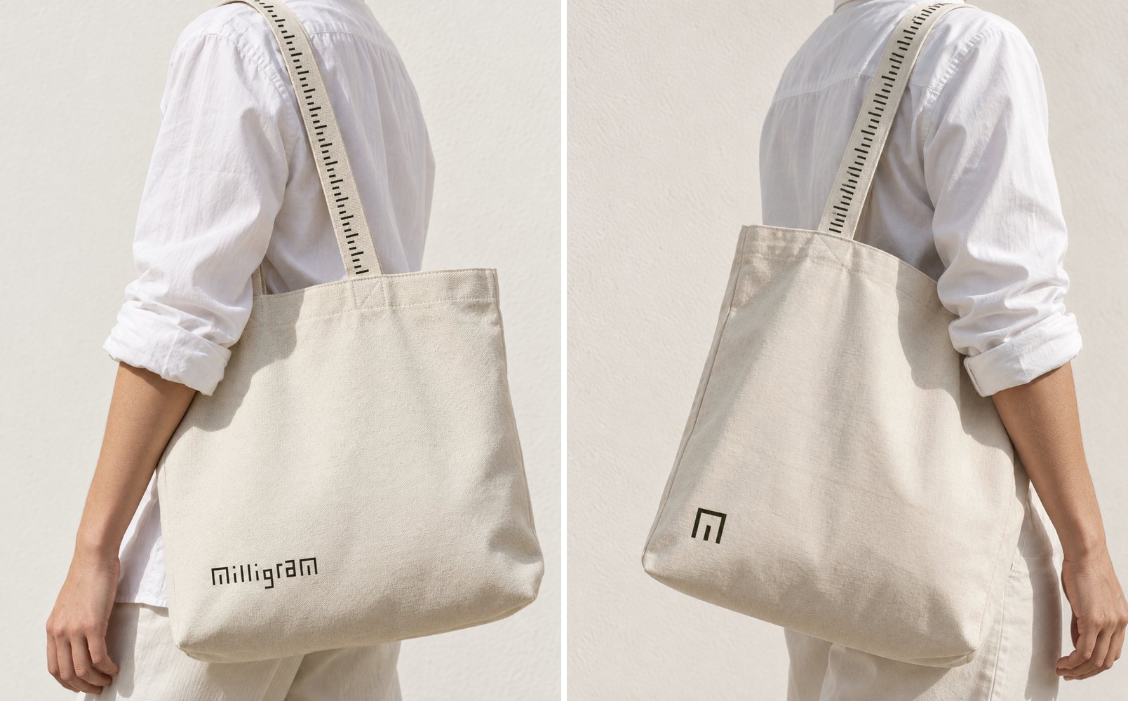
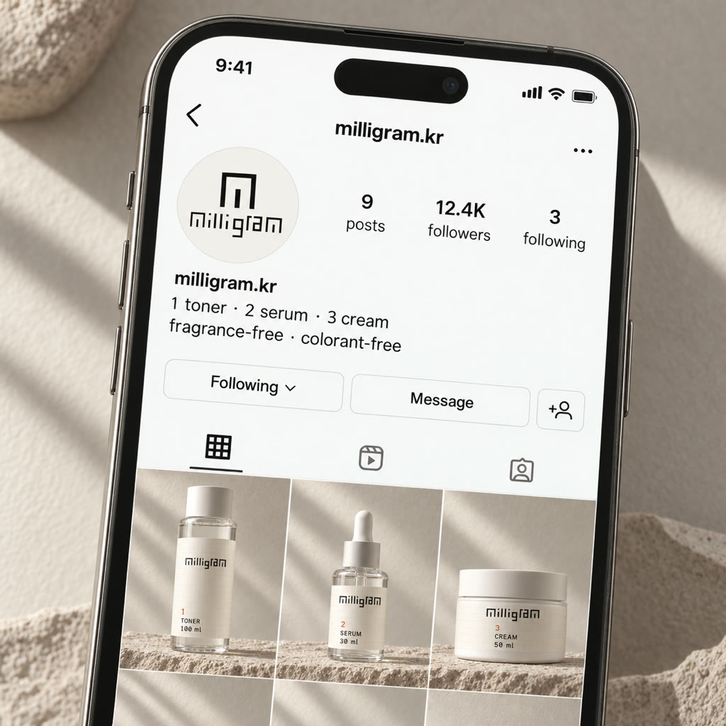
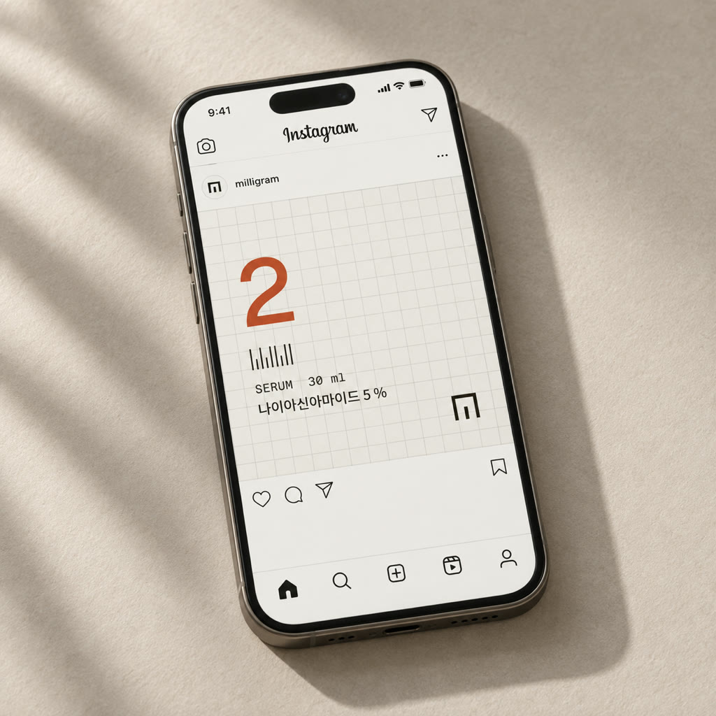
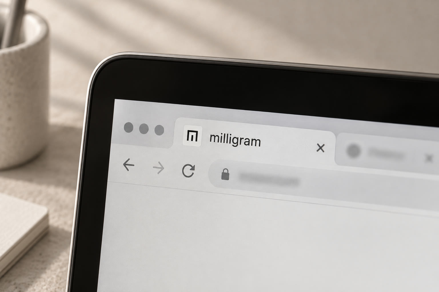
- Labels · Carton · Tape · Instagram · Favicon · Brand film — renders, not to spec
- Studio
- Little Obsession
Overview
Brand identity development · 2026
성분과 함량을 따져 읽는 소비자가 늘면서, 스킨케어는 핵심 성분을 얼마나 많이 넣었는지로 경쟁한다. 그러나 높은 숫자가 곧 좋은 제품이라는 인식 속에서 '왜 이 성분을 이만큼 넣었는가'는 설명되지 않았다. 원료 업계에서 일한 창업자가 만든 밀리그램은 이 익숙한 함량 경쟁에 다른 기준을 제시하려 했다.
기존 아이덴티티는 민트 컬러와 물방울, 유선형 그래픽으로 순하고 촉촉한 인상을 전했지만, '필요한 성분을 필요한 만큼 정확하게 설계한다'는 관점은 드러나지 않았다. 브랜드의 기준을 '더 많은 함량'이 아닌 '정확한 함량'으로 다시 정의하고, 제품 설계의 태도가 패키지에서 읽히는 비주얼 아이덴티티를 세웠다.
As more shoppers read ingredient lists and percentages, skincare has come to compete on how much of a hero ingredient goes in. Under the belief that a higher number means a better product, one question went unanswered: why this ingredient, and why this much. Milligram, founded on its founder's years in the raw-material trade, set out to give this familiar concentration race a different standard.
The old identity spoke in mint, water drops and streamlined shapes. It read as gentle and hydrating, but said nothing of the brand's real stance: every ingredient designed in exactly the amount the skin needs. We redefined the standard from “more” to “exact”, and built a visual identity in which the way the products are designed can be read from the package itself.
한 방울까지, 필요한 만큼만.
밀리그램은 더 많이 넣는 대신, 피부에 필요한 성분을 필요한 만큼 정확하게 설계합니다.
Measured to the drop. Only what it takes.
Instead of adding more, Milligram precisely formulates each ingredient to give your skin only what it needs.
Strategy
Exact, not more · 정확한 함량이라는 기준
좋은 포뮬러는 더 많이 넣는 데서가 아니라, 피부와 제품의 목적에 맞는 양을 정확하게 설계하는 데서 시작한다. 이 관점 위에서 각 제품을 대표하는 성분과 함량을 앞면에 분명히 드러내고, 그 뒤에 보조 성분과 전체 포뮬러의 설계 이유를 투명하게 설명하는 제품 체계를 세웠다. '고함량'이 아닌 '정확한 함량'이 밀리그램의 기준이다.
밀리그램의 소비자는 유행 성분이나 높은 숫자만으로 제품을 고르지 않는다. 전성분과 함량을 확인하고, 자신의 피부에 필요한지 한 번 더 살핀다. 고함량과 복잡한 루틴이 더 나은 결과로 이어지지 않는다는 것을 경험으로 알고, 피부가 예민해진 뒤로는 강한 효능만큼 예측 가능성과 선택의 확신을 원한다. 그래서 전략은 절제와 일관성이다. 대표 성분과 함량을 보여 주고 그 이유를 설명해 안정감을 주고, 이 브랜드에 머무르게 한다.
A good formula does not begin with adding more. It begins with designing the amount that fits the skin and the product's purpose. On that view we built a product system: the ingredient and amount that define each product stated plainly on the front, and behind it a transparent account of the supporting ingredients and why the whole formula is designed as it is. Not “high concentration” but “exact concentration” is Milligram's standard.
Milligram's customer does not choose by a trending ingredient or a big number. They read the full list and the percentages, then ask whether their skin needs them at all. Experience has taught them that high doses and long routines do not add up to better skin, and once their skin turned sensitive they came to value predictability and confident choice as much as potency. So the strategy is restraint and consistency: show the ingredient and the amount, explain the reason, give them steadiness, and give them a reason to stay.
Positioning
The empty seat · 빈 자리
경쟁 브랜드 대부분은 감성·순함 쪽에 모여 있고, 정보를 말하는 소수는 기술적이고 차갑다. 정보를 말하면서도 따뜻한 자리는 비어 있었다.
기존의 ‘순함’을 표현하던 감성적 시각 언어에서 벗어나, 성분과 함량이라는 구체적인 정보를 아이덴티티의 중심으로 옮겼다. 다만 정보 중심의 표현이 임상적이고 차가운 인상으로 이어지지 않도록 절제된 여백과 따뜻한 물성을 함께 설계했다. 정확하지만 차갑지 않은 것. 그 지점을 밀리그램의 새로운 시각적 영역으로 정의했다.
Most competing brands crowd the emotional, gentle side of the map, and the few that speak in information are technical and cold. The seat that speaks in information and still feels warm was empty.
We left the emotional visual language that once stood for “gentle” and moved concrete information, the ingredient and its amount, to the centre of the identity. So that an information-led expression would not read as clinical and cold, we designed restrained space and a warm materiality alongside it. Exact, but not cold. That is the point we defined as Milligram's new visual territory.
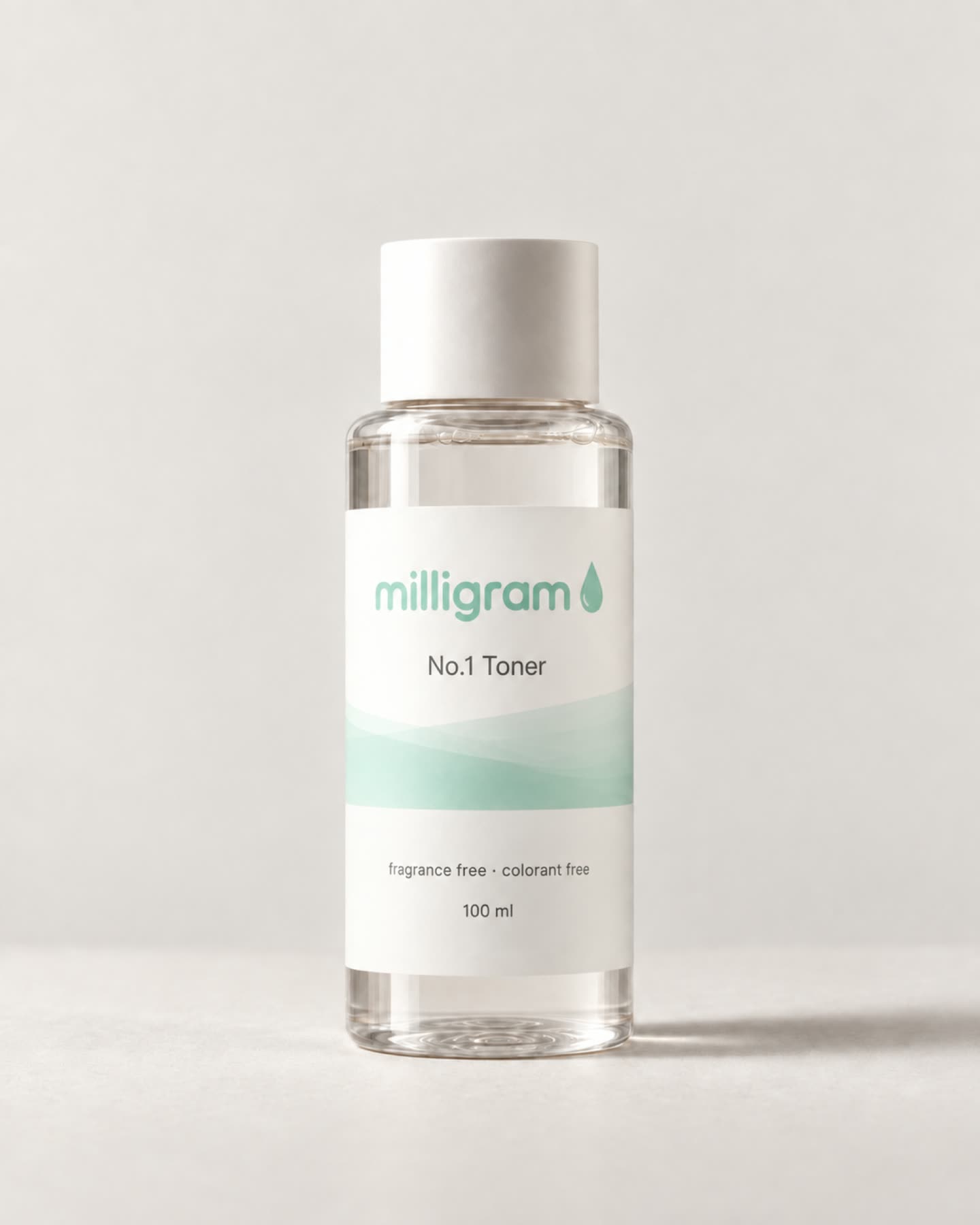
Before
순함과 수분감에 머물러 있던
익숙한 스킨케어의 언어
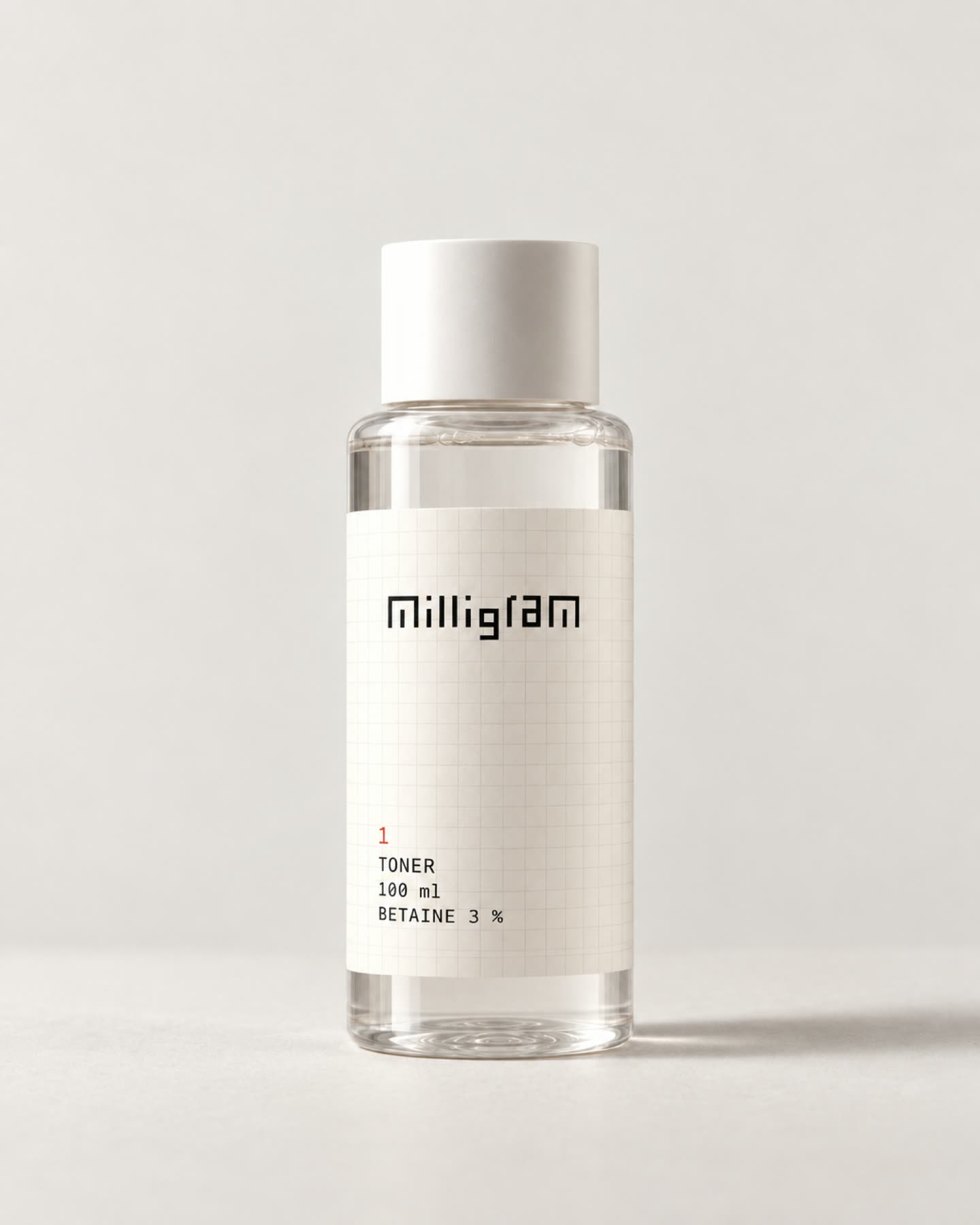
After
대표 성분과 함량을 전면에 드러낸
정확한 설계의 언어
Verbal
Tagline · A language of precision
더 많이 말하지 않고, 필요한 만큼 정확하게 말한다.
밀리그램의 언어는 제품을 과장하거나 감각적인 표현으로 대신하지 않는다. 무엇을 넣었는지, 얼마나 넣었는지, 그리고 왜 그 양을 선택했는지를 소비자가 이해할 수 있는 언어로 설명한다. 짧고 명확한 문장, 구체적인 성분과 숫자, 그리고 그 선택의 이유가 밀리그램의 목소리를 만든다.
It does not say more. It says exactly as much as is needed.
Milligram's language does not overstate the product or stand in for it with sensory phrasing. It explains what went in, how much, and why that amount was chosen, in words a customer can follow. Short, clear sentences, specific ingredients and numbers, and the reason behind each choice make Milligram's voice.
Measured, not more.
딱 필요한 만큼, 정확히.
Wordmark & Symbol
Measurement, built into the letters
밀리그램의 ‘측정’이라는 태도를 글자의 구조 안에 담았다.
모든 세로획은 일정한 피치 위에 놓이고, 긴 획과 짧은 획의 반복은 자의 눈금을 연상시킨다. 동일한 모듈과 간격의 규칙으로 워드마크 전체를 구성하고, 그 구조에서 m을 분리해 브랜드 심볼로 확장했다.
Milligram's attitude of measurement is built into the structure of the letters.
Every vertical stroke sits on a constant pitch, and the alternation of long and short strokes recalls the ticks of a ruler. One rule of module and spacing composes the whole wordmark, and from that structure the m is lifted out and extended into the brand symbol.
P 40 · W 12 · X 96 = 8W · 15 stems on one pitch · word 572 = 14P + W
Graphic System
One structure, four elements · 하나의 구조, 네 요소
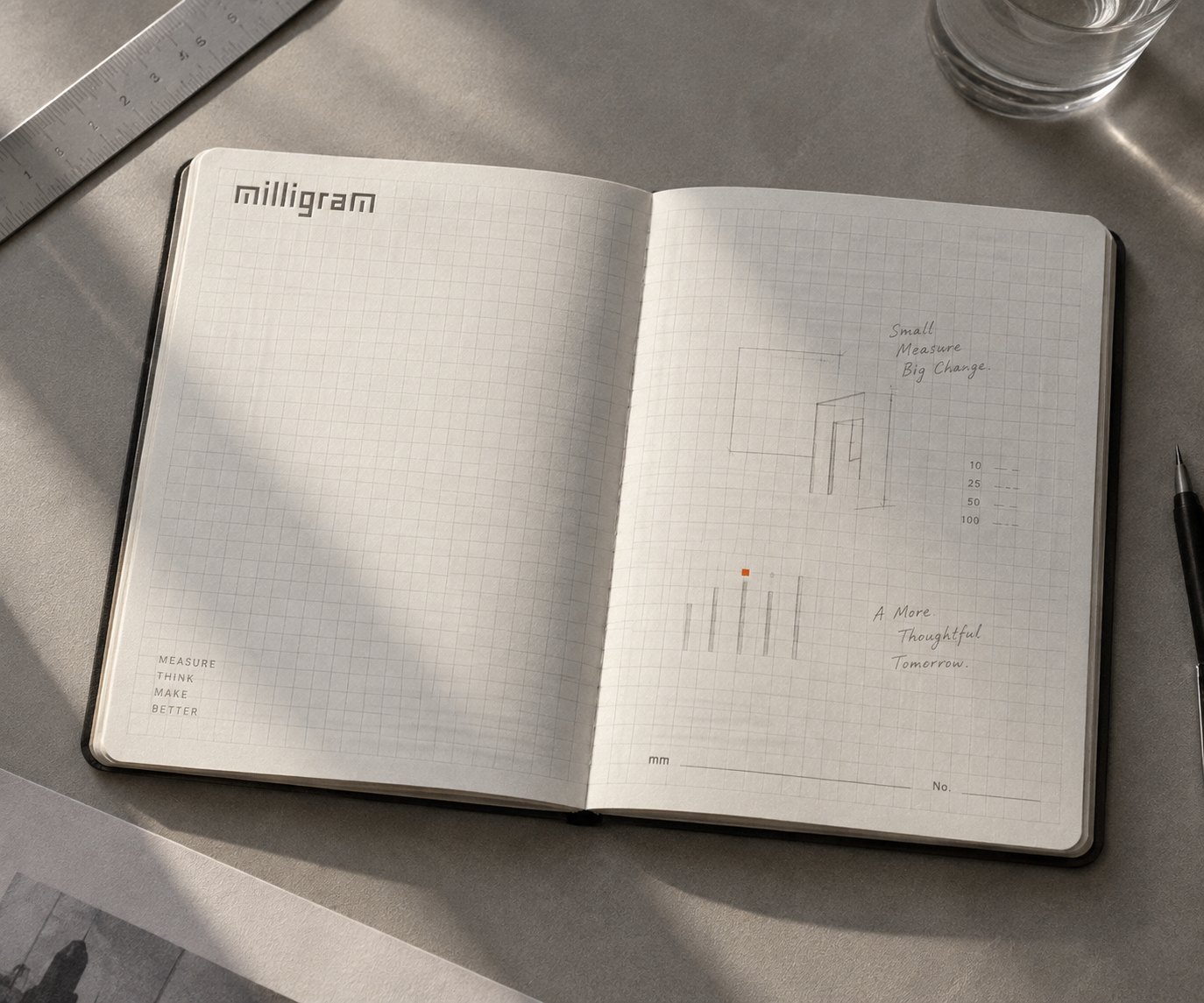
밀리그램의 그래픽은 ‘재는 행위’를 시각화하는 데서 출발했다. 워드마크의 세로획이 놓인 피치가 격자가 되고, 긴 획과 짧은 획의 리듬이 눈금 띠가 되며, 양을 채우지 않고 눈금으로 가리키는 게이지와 시작 자리를 표시하는 사각 점이 거기서 나왔다. 네 요소는 하나의 구조에서 나왔기에 어떤 접점에서도 같은 언어로 읽힌다.
Milligram’s graphics begin by visualising the act of measuring. The pitch the wordmark’s strokes stand on becomes the grid, and the rhythm of long and short strokes becomes the ruler strip. From the same structure come a gauge that points to a quantity with a tick instead of filling a bar, and a square dot that marks where things start. Because the four elements share one structure, they read as one language at every touchpoint.
00 WORDMARK
One wordmark. A system to measure.
하나의 워드마크에서 브랜드의 그래픽 언어가 시작됩니다.
01 GRID
워드마크의 세로획은 같은 피치 위에 놓입니다.
The grid inherits the rhythm of the wordmark.
02 RULER STRIP
글자의 긴 획과 짧은 획이 반복되어 하나의 리듬이 됩니다.
Letters become ticks.
03 GAUGE
채워진 막대가 아닌, 눈금으로 수량을 보여줍니다.
Ticks show the quantity, not a filled bar.
04 DOT MARKER
작은 사각형이 시작하는 자리를 표시합니다.
A simple square marks where things start.
05 SYSTEM
하나의 구조가 네 가지 그래픽 자산으로 확장됩니다.
One structure. Four graphic elements.
00 WORDMARK
One wordmark. A system to measure.
하나의 워드마크에서 브랜드의 그래픽 언어가 시작됩니다.
01 GRID
워드마크의 세로획은 같은 피치 위에 놓입니다.
The grid inherits the rhythm of the wordmark.
02 RULER STRIP
글자의 긴 획과 짧은 획이 반복되어 하나의 리듬이 됩니다.
Letters become ticks.
03 GAUGE
채워진 막대가 아닌, 눈금으로 수량을 보여줍니다.
Ticks show the quantity, not a filled bar.
04 DOT MARKER
작은 사각형이 시작하는 자리를 표시합니다.
A simple square marks where things start.
05 SYSTEM
하나의 구조가 네 가지 그래픽 자산으로 확장됩니다.
One structure. Four graphic elements.
SYSTEM IN USE
DRAG · SCROLL
MILLIGRAM
- 1 TONER
- 2 SERUM
- 3 CREAM
BETAINE
3 %
MILLIGRAM
- 1 TONER
- 2 SERUM
- 3 CREAM
NIACINAMIDE
5 %
MILLIGRAM
- 1 TONER
- 2 SERUM
- 3 CREAM
CERAMIDE
1 %
Colour
Paper, ink, one red · 종이, 잉크, 적색 하나
스킨케어 브랜드는 흔히 파랑과 민트로 순함을, 검정으로 임상과 기술을 말한다.
밀리그램은 색을 더하는 대신 덜어냈다. 종이 그대로의 바탕과 한 가지 잉크를 중심으로, 강조색은 필요한 곳에만 작게 사용한다.
성분을 덜어내듯 색도 필요한 만큼만 남겼다.
Skincare brands usually say gentle with blue and mint, and clinical with black.
Milligram took colour away rather than adding it. Around the paper itself and a single ink, the accent is used small, and only where it is needed.
As the ingredients were pared back, so was the colour. Only as much as it takes.
Subtraction → addition · 6 states · 유채색에서 시작해 근거별로 피하고, 마지막에 종이와 잉크를 더한다 · stepped, hard cuts, looping
01 The shelf · 매대의 유채색
파랑·초록·빨강·베이지·민트·노랑·분홍
The shelf’s chromatic colours
02 − Blue
신뢰·안정·전문. 그러나 매대에서 가장 흔한 색, 더마 남색과 물의 관습.
Trust, calm, expertise — and the shelf’s most common colour, the derma and water convention.
03 − Green · Mint
자연·건강·순함. 밀리그램의 기준과 맞지 않는 ‘순함’의 코드.
Nature, health, gentleness. The code of ‘gentle’, which does not fit Milligram’s standard.
04 − Yellow · Pink
비타민·톤업의 기능 코드 / 성별을 특정하는 색.
The vitamin and tone-up code / a colour that genders the product.
05 + Paper · Ink
흰·검을 더한다. 순수·단순·정직, 그리고 현대·세련. 흰 바탕에 잉크로 — 검정이 주조가 되면 임상이지만 글자에만 쓰면 정직이다.
Add white and black: pure, simple, honest, and modern, refined. Ink on a white ground — black as the main colour reads clinical; used only for letters, it reads honest.
06 Milligram
종이·회색·잉크·적색, 필요한 만큼만.
Paper, greys, ink, one red. Only as much as it takes.
- paper#F2F1EF
- grey-1#D1CFCB
- grey-2#BBB6B1
- grey-3#9F9A93
- ink-2#574D3F
- ink#292416
- accent#C8542E
- accent-text#AF4523
로고는 잉크 한 색. 색은 점 하나에만.
Red ≤ 5 % of any surface · one red element per surface · never a fill, the letters, or over a photo
Packaging
Say less in front, exactly in back · 앞에서는 덜, 뒤에서는 정확히
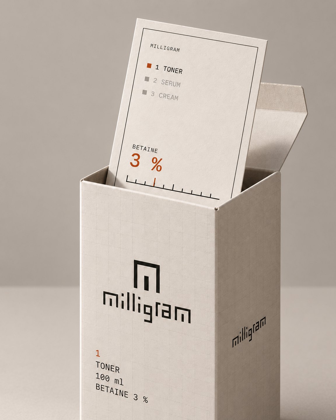
밀리그램의 패키지는 하나의 규칙으로 설계됐다. 앞면에는 제품을 구분하는 번호와 유형, 용량, 대표 성분과 함량만 남겼다. 뒷면에는 보조 성분과 그 이유를 정확히 적었다. 앞에서는 덜 말하고, 뒤에서는 정확히 말한다.
종이 그대로의 바탕에 한 가지 잉크를 사용하고, 붉은색은 제품 번호에만 작게 남겼다. 제품이 늘어나도 바뀌는 것은 번호와 내용뿐이다. 나머지는 같은 자리에서 같은 방식으로 반복된다.
Milligram’s packaging is designed as one rule. The front keeps only what tells the products apart: the number, the type, the volume, the lead ingredient and its amount. The back states the supporting ingredients and the reasons, exactly. Say less in front, say it exactly in back.
The ground is the paper itself with a single ink, and red is kept small, on the product number alone. As products are added, only the number and the contents change. Everything else repeats in the same place, in the same way.
Plate 1 · Front / back · 같은 축척 · 34 × 100 mm · 앞면은 넷, 뒷면은 이유
Back · 보조 성분과 이유 · supporting ingredients
NIACINAMIDE · 5 %
예민해진 피부의 진정과 장벽 케어를 위한 대표 성분.
목표 효능에 필요한 만큼만, 사용감이 무거워지기 전 농도인 5 %로 설계했습니다.
GLYCERIN
수분을 끌어당겨 유지하는 보습 베이스.
포뮬러의 기본 보습 구조를 담당합니다.
ALLANTOIN
피부 컨디셔닝을 보조합니다.
대표 성분을 보완하도록 구성했습니다.
HYALURONIC ACID
피부의 수분 유지를 보조합니다.
보습 구조를 보완하도록 설계했습니다.
향료·색소는 넣지 않았습니다.
전성분은 상자 옆면에 있습니다.
34 × 100 mm · 4.6 px / mm · 워드마크 20 mm(면 폭의 59 %) · 여백 4 mm · 적색은 번호 하나
Plate 2 · Dieline · 148 × 158 mm · 자르는 선 실선 · 접는 선 점선
GLUE 12 · SIDE L 34 · FRONT 34 · SIDE R 34 · BACK 34 · 턱 29 · 더스트 26 · 3.6 px / mm
Fold sequence · 01–05 · 2D 칼선이 3D 상자가 된다
- 01FLAT전개도 — 인쇄물이 축척대로 들어 있다
- 02SIDES UP옆면 두 장이 선다
- 03BACK UP뒷면이 닫히고 윗면이 열린 상태
- 04TUCKS CLOSED턱 플랩이 들어간다
- 05STANDING앞면이 보이는 상자
Plate 3 · Packaging system · true relative scale
- 1 TONER · 100 ml · BETAINE 3 % · 45 × 45 × 125 mm
- 2 SERUM · 30 ml · NIACINAMIDE 5 % · 34 × 34 × 100 mm
- 3 CREAM · 50 ml · PANTHENOL 5 % · 62 × 62 × 55 mm
- FIXED
- Wordmark 20 mm · grid · column order · paper · ink · red number
- VARIABLE
- Number · type · volume · ingredient + % · carton size
Client
Self-initiated concept
Scope
Positioning · Wordmark · Colour · Typography · Graphic system · Imagery direction · Guide
Concept applications
Labels · Carton · Tape · Instagram · Favicon · Brand film — renders, not to production spec. The previous design shown above is a simulation built from the brief.
Studio
Little Obsession · 2026